Saturday, January 15, 2011

Teknik Trading TSM2C (terbaik,senang,menguntungkan 2 candle)

Senang je.mula mula bukak 1hour chart any currency.

Pastu, tunggu for a bull or bear candle to form, after it closes bullish or bearish, kemungkinan besar candle selepasnye will form bull or bear candle...theres some easy pips for you.

Cari 2 candle yang sama arah untuk jadikan entry.

contoh:

First candle bull,second pun bull..
Guna 2 candle ni untuk dapatkan entry dan stoploss.
First candle nye low jadikan stoploss dan second candle nye high
jadikan entry.Tapi kalau nk tunggu retracement dulu pun bleh baru enter market untuk kurang kan risk.

Entry dan Exit Rules:
Bull candle --- Stoploss at the low of the previous candle, target profit sama ngan ape yang ko risk or 2 kali ganda ape yang ko risk.
Bear candle --- Stoploss at the high of the previous candle, target profit sama ngan ape yang ko risk or 2 kali ganda ape yang ko risk.
No trade --- If next candle starts to form against the direction of the previous candle.

CONTOH enter trade dan cara mengenal pasti trend:

Stop loss bawah candle 1 or 10-20 pip untuk sell dan 10-20 pip untuk profit dan sebaliknye untuk buy. Kira suma bergantung pada kita nye money management. Pakai mane yang kita rase sesuai pada situasi dan cara kita trade. Kadang2 kalau sy pkai stoploss bawah candle 1,take profit sy ikut ape yang saye risk. Kira nye risk and reward saya 1:1. Teknik ni kalau nak lagi selamat pakai (MA period-24 shift-10). Follow the trend, the trend is your friend.


Note: The best bull or bear candles are ones that are one-sided or ones that have little or no wick. (strong bull/bear candle)

Thursday, January 6, 2011

Economic Numbers that Move the US Dollar

1. How important the market considers a particular release to be.

2. How close to market estimates the number comes in at. Remember that markets anticipate news, so generally if an economic release comes out as expected, there is very little if any market reaction to that release.

How important the market considers a particular economic release to be, is something that changes over time depending on what is happening from a US Dollar fundamentals standpoint. If there are worries that the economy is going into recession, then the market is going to be extra sensitive to any numbers, such as non farm payrolls and consumer spending, which may provide early warning signs that this is the case. Conversely, if the economy is heating up and the markets are worried that inflation may become a problem, then the most market moving numbers may be price data releases, such as the CPI and the PPI. For your reference, according to Dailyfx.com the most market moving indicators for 2007, in order of importance were:

1. Non Farm Payrolls
2. FOMC Releases
3. Retail Sales
4. ISM Manufacturing
5. Inflation
6. Producer Price Index
7. The Trade Balance
8. Existing Home Sales
9. Foreign Purchases of US Treasuries (TIC Data)

Why the US Dollar is Still the King of the Currency World

The first reason why the US Dollar is the king of the currency world is the fact that it is a part of each of the world’s most actively traded currency pairs. According to the Bank of International Settlements and as outlined here, these currency pairs account for 67% of the daily turnover in the forex market. When you add the US Dollar Swidish Krona currency pair and all of the currencies categorized as “other” traded against the US Dollar, that total rises to 89%

EUR/USD 27%
USD/JPY 13%
USD/GBP 12%
USD/AUD 6%
USD/CHF 5%
USD/CAD 4%
USD/SEK 2%
USD/Other 19%

A second reason why the US Dollar is still the king of the currency world is because it is the world’s primary reserve currency, accounting for over 63% of the world’s currency reserves. A reserve currency is a currency held by the governments/central banks of other countries in large quantities. Countries do this so they can purchase goods which are priced in the reserve currency at a cheaper rate than if they had to convert, and to borrow money at a cheaper rate, since lenders will be more likely to lend knowing they hold large quantities of what is considered a more credible currency. Perhaps most importantly for traders, many countries and especially countries in Asia (the most talked about example being china) maintain large reserves of US Dollars so they can either peg the value of their currency to the US Dollar, or maintain a loose peg. The goal here is to either stabilize their own currencies and therefore their economies and/or to hold the value of their currencies artificially low in order to make their goods more competitive overseas, something which we will examine further in our next lesson.

Thirdly, many private businesses and individuals located outside the United States hold US Dollars for trade reasons, because they consider the currency more stable than their home country’s currency, or for a multitude of other reasons. This, combined with what we just covered on the US Dollar being the world’s primary reserve currency, means that over 2/3rds of all US Dollars in circulation are held outside of the United States.
The last major reason why the US Dollar is still king of the currency world is because many major commodities such as oil, gold, and silver are priced in US Dollars, making access to US Dollars essential for anyone in the world who wants to purchase these products.

More than simple interesting facts, these factors can have huge affects on the value of the US Dollar, and are therefore extremely important to us as traders. Exactly how these things affect the US Dollar, and therefore exactly what we should watch out for as traders will be the topic of our next lesson so I hope to see you then.

As always if you have any questions or comments please leave them in the comments section below, and good luck with your trading!

Moving Average

A Moving Average is a simple measure of the average price or exchange rate over a specific time frame. For example, if we take the closing prices of the last 10 days, add them together and divide the result by 10, we have created a 10 day Simple Moving Average (MVA on Trading Station 2).

"Market Noise"

Student’s Question:I have heard the expression “Market Noise” but do not know what it means. Thanks!Instructor’s Response:“Market Noise” refers to the very random price action that occurs on lower time frame charts. It is the normal movement and fluctuation of the price of a currency pair during the trading day. It is much more pronounced on the lower time frame charts. This is one reason why trading on those lower time frames can be more challenging.Take a look at the 5 minute chart below…
Market_Noise_body_34689d1249351189-post-day-chart-8-03-09.png, "Market Noise"

Each 5 minute candle reflects the all the trades that were made during that 5 minute period. Since the time frame is so short, oftentimes, no discernable trading pattern can be identified. Because of that, identifying entries along with the placement of stops and limits are much more difficult. As a trader moves to larger and larger time frames, the price action will be less random and, therefore, “Market Noise” will become less and less of a factor.

What Do They Mean by Overbought and Oversold?

Many times in trading we here the terms overbought and oversold. We hear an analyst state that the AUD/USD is overbought and due for a correction or that the EUR/CHF is oversold and due for a bounce. But how does one determine what is overbought and what is oversold and just what does that mean?
The terms are used to describe a market condition that is quantified by certain technical indicators. These indicators are called oscillators with two popular examples being the Stochastics and RSI. An oscillator is a commonly used momentum indicator that measures the current currency price compared to its historical price over a given time period. It looks to gauge the strength and momentum of a currency pair's move by measuring the degree by which a currency is overbought or oversold. The scale for the both indicators is 0 to 100. When Stochastics reaches a value of 80, the market is considered overbought and when Stochastics reaches a value of 20, the market is considered oversold. RSI uses the same scale of 0 to 100, but the value for overbought is 70, while the value for oversold is 30. The idea is when the market reaches either extreme, the chance for a reversal increases.
However, a reversal is not imminent.
Markets that are in a strong uptrend can remain overbought for long periods of time and markets that are in a strong downtrend can remain oversold for long periods of time. This is why these oscillators have limited value in trending markets. However, when the market is in a downtrend and the oscillator moves up to overbought, there is a much better chance of a reversal. On the flip side, when the market is in an uptrend and the oscillator moves down to oversold, there is also a good chance of a reversal.
Here is an example using the daily chart of the AUD/USD. Also plotted on the chart is a Slow Stochastics using values of 15,5,5. You can see that while the market is in an uptrend, the Stochastics will spend more time in an overbought condition and little time in the oversold condition. This is typical in a strong uptrending market. Also, when Stochastics moves down to an oversold condition, the market has a tendency to reverse. This is one way some traders use this tool to identify a buying opportunity. But the key here is that the market is in an uptrend. If the market was in a downtrend, the opposite would be true and those same traders would treat a move up to overbought as a selling opportunity. So while oscillators can be valuable in identifying trading opportunities, it is the direction of the trend and trading in that same direction that increases the reliability of these tools.
Overbought_and_Oversold_body_74432d1292594911-chart-day-weekly-trading-lesson-1217.png, What Do They Mean by Overbought and Oversold?

Stops and Limits

Stops and Limits
The placement of stops and limits is a critical component to successful trading.  Stops are put on a trade to take a trader out of a trade at a predetermined point at a worse price than the current price.  Think of them as a safety net, that will prevent you from losing more money on this trade. Stops are often set based on a certain percentage of loss relative to the size of the trader’s account, or based levels of support and resistance.  These are two of the more widely used criteria.  Whatever method is chosen, it is imperative to have a protective stop in place on each and every trade that is placed.  Without them, a trader leaves themselves open to potentially catastrophic losses.
A limit will take a trader out of their position as well, but at a better price than the current one.  Limits are often based on levels of support or resistance as well though they are sometimes also based on Risk Reward Ratios.  You can consider limits to be your “target” for a trade, where you want to get out if the market goes far enough in your favor.  While many would not consider limits to be as critical to prudent trading as stops would be, limits can be very helpful in assisting the trader in making the critical decision regarding when to exit a trade.
Stop Placement
In essence, our protective stops should be placed at a logical point based on the chart, where the markets “should not trade” if our trading assumption was correct.   Let’s take a look at a chart to elaborate on this point.
stops1
In the trading scenario depicted above, we see the pair is in a downtrend.  Moreover, it has respected the trendline that we have put on the chart.   Based on this, we would take a short position each time price action trades up to trendline resistance without a candle closing above the line.  We can see that the pair traded up to our trendline and did not close above it.  At that point we can sell the pair.
Our stop on the trade would be placed above the trendline so that the pair has a little room to breathe.  If we place our stop precisely at the level to which the pair has already traded, we run the risk of the price trading up to that same level again and stopping us out perhaps just prior to the trade moving in our direction.  Since this is a Daily chart (the longer the time frame, the wider the stops need to be) and this GBPAUD is a pretty volatile pair, our stop should allow a little more breathing room than we would give on a 1-hour chart for a less volatile pair.  We have placed our stop in an area that “the pair should not trade”.  If the pair does trade in this area, we want to be out of the trade since the trendline will have been compromised and our trading plan is no longer valid.
In this case, a stop in the range of 50 – 75 pips above the trendline might be in order.  That would allow the price to spike above our trendline to a fair degree without stopping us out.
Let’s look at a couple of other methods for stop determination.
stops2
Using the same chart, but using the Fibonacci Retracement tool, we see that price action retraced up to the 38.2% level, the same point that priced touched our trendline in the previous example.  Once the trader sees price respecting one of the Fib levels, a short position can be taken with a stop just above the Fib line.  Once again, the 50-75 stop above price action and the Fib level would apply.
The ATR (Average True Range) indicator can also provide insight as to the distance that we need to place our stop from our entry.  When you put an ATR on a chart, it will tell you the average distance that the currency in question will move over the time frame on the chart.
stops3
Looking at this 1-hour chart of the GBP/CHF, we can see that the 1-hour ATR on this pair is 50 pips.  This means that, on average, every hour the pair has the potential to move 50 pips.  If we were to go long this pair at 1.6494 then our stop would be placed 50 pips below our entry at 1.6444.
One of the keys to stop placement is to allow the pair some room to move.  New traders oftentimes will place very tight stops since they do not want to have too big of a loss on a trade.  While that thought process makes sense, it is quite likely setting yourself up for failure.  By placing a stop too close to where the pair is trading is almost begging for the stop to be triggered.
Another factor to be taken into consideration when placing a stop is the size of one’s trading account.  Most new traders find this somewhat surprising.  It is critical however not to put too large percentage of your account at risk by placing a stop too deep.
A way to monitor this is to follow the 5% rule.  A trader should not put more than 5% of their account at risk at any one time.  Using the ATR example on the 1-hour chart of the GBP/CHF pair above, we saw that a 50 pip stop was required, based on the ATR method.  If I have a $1000 account, 5% of it is $50.  So, based on our rule, a trader with that account size could place one trade with a 50 pip stop on it.  If the stop is triggered, the $1000 account would become a $950 account, having absorbed a 5% loss.  Following the 5% rule a trader could not open any additional positions since they would be putting more than 5% of their account in jeopardy.  Most professional traders seem to follow a 1% or 2% rule in this area.

Placing Limits
Limits can be set to exit a trade based around support and resistance levels or a Risk Reward Ratio.
stop4
The above chart examines the Risk Reward Ratio method.  A trader should always observe at least a 1:2 Risk Reward Ratio (RRR) on every trade.  On the above chart we have placed a 50 pip stop on the trade.  To observe a 1:2 RRR we would then double the amount of the stop (2 x 50 = 100) and we would then set our stop 100 pips above our entry price of 1.6501.
Using the Support Resistance level to determine exit points can be seen on the chart below.
stops5
On this chart we can see our first Resistance level (R1) and our secondary Resistance level (R2).  Price action already was stopped once at R1 and that may present a barrier again.  So a trader might choose to exit all or a portion of their positions as price approaches that level again.  Assuming that price action breaks through the R1 level, the next target would be R2 at about the 1.6700 level.  We can see on the left of the chart that the 1.6700 level successfully acted as resistance earlier and most likely will present a ceiling again as the pair approaches that level.
Managing your risk is an integral part of trading, and Stop and Limit orders are some of your most powerful risk management tools.  Take some time to practice placing stops and limits in a demo account to feel out the process in your trading.
To learn in-depth trading tips and advance your strategy with personal attention from our experienced course instructors, take a DailyFX Course.

Support and Resistance

Support and Resistance is the most important thing Technical Analysis.  Let’s start out our discussion by looking at a chart.
support1
As you can see on the chart above, Support is a price level below which a currency pair has difficulty going and Resistance is a price level above which a pair has difficulty going.  Think of the area between support and resistance as being a room.  Support is the floor and resistance is the ceiling.  The pair will move between those two levels until a “breakout” occurs in one direction or the other.
In theory, support is the price level at which demand (buying power) is strong enough to prevent the price from declining further.  The rationale is that, as the price gets closer and closer to support, and becomes cheaper in the process, buyers see a better deal, and are more likely to buy.  Sellers become less likely to sell, since they are getting a worse deal.  In that scenario, demand (buyers) will overcome supply (sellers) and that will prohibit price from falling below support.
As one might suspect, support does not always hold.  When price breaks below support, that indicates that the sellers have won out over the buyers.  This breach of support indicates that now the trading mindset is more inclined to sell than buy.  After a support level is broken, a trader can expect another level of support to be established at the next point where buyers have established themselves.
Resistance, on the other hand, is the price level at which supply (selling power) is strong enough to prevent the price from rising further.  The rationale behind this is that as the price gets closer and closer to resistance, and becomes more expensive in the process, sellers are more likely to sell and buyers become less likely to buy.  In that scenario, supply (sellers) will overcome demand (buyers) and that will prohibit price from going above resistance.
Like support, resistance does not always hold and a break above resistance demonstrates that the bulls (buyers) have won out over the bears (sellers).  Since resistance has been broken, buyers now have an increased willingness to buy at even higher prices since price has continued to move up, and doesn’t look likely to come back down.  Once the former resistance level is broken, a new level of resistance will be formed at a level where sellers have taken a stand.
As a general rule, the longer the time frame of the chart, the stronger the established support and resistance levels will be.  In other words, support and resistance levels reflected on a Daily chart will be stronger than those appearing on a 1-hour chart, for example.
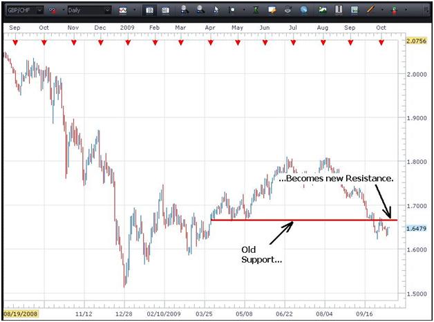
There’s an old support/resistance axiom that I would like to share with you.  When support is broken it becomes new resistance.  When resistance is broken it becomes new support.  Let’s go back to the room analogy that was mentioned earlier.  Let’s say you are in a two story building and the floor gives way and you fall through it to the lower level.  The floor that had been supporting you until it gave way, is now the ceiling that is above you…old support (the former floor) becomes new resistance (the new ceiling).  Conversely, if somehow you were able to jump so high that you were to go through the ceiling of a room, you would be standing on the former ceiling which is now the new floor.
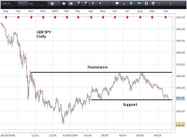
Let’s take a look at this concept on a chart.
support2
We can see on the above chat how once the old support line is compromised when the pair trade through it to the downside, it now becomes new resistance.  Conversely when resistance is broken through on a chart, it becomes new support.
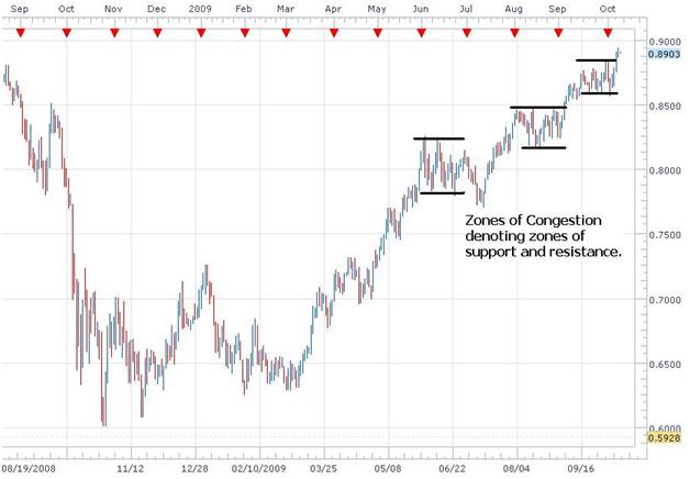
As seen on the chart below, support and resistance levels can be identified by looking for areas of “congestion” on the charts…areas where the buyers and sellers have been battling over control.
support3
Also, levels can be established by connecting the recent lows for support and recent highs for resistance.
support4
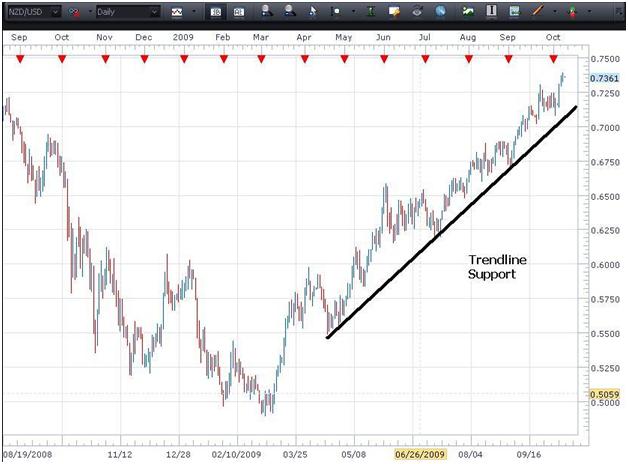
In an uptrend, once the trendline is established, a new long position can be taken when price action trades down to support and respects support so that a candle body does not close below it.
Ideally, for a trendline to be considered valid, we would like to see three “touches” by price action along the line.  Until that third touch occurs, there is not enough evidence to say that the trendline is a true trendline.
support5
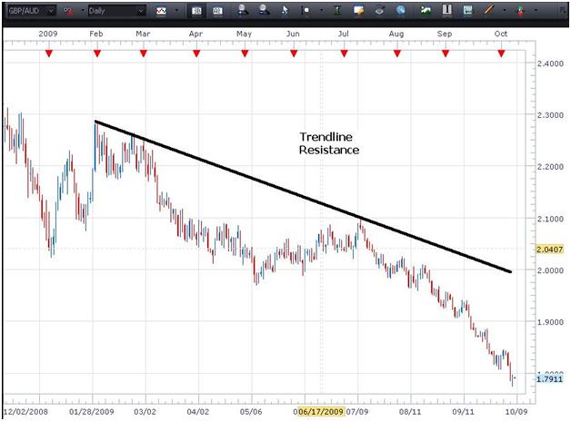
In a downtrend, once the trendline has been established, a new short position can be taken each time price action trades up to trendline resistance without a candle body closing above the line.
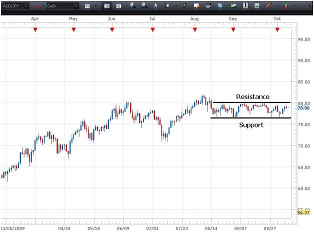
Support and Resistance levels are critical in employing a Range Trading strategy.  On the chart below we can see how this AUD/JPY pair continues to trade between established levels of support and resistance.  A trader would engage in Range Trading by buying at support and selling at resistance.  The trader can do this repeatedly until a breakout occurs.
support6
It is important that a trader be able to identify key support and resistance levels in order to successfully practice technical analysis.  Since interpreting charts is not an exact science and it is difficult to establish a precise level, simply being aware that these levels exist and their approximate location on a chart can enhance one’s analytical skills.
In a nutshell, if a pair is closing in on a significant support level, that can signal to a trader to be on the lookout for signs of buying pressure and a potential reversal.  On the other hand, if a currency pair is approaching a level of significant resistance, that can signal the trader to be on the lookout for signs of selling pressure and a potential reversal.
Should a support or resistance level be broken, that is a sign that the relationship between supply (sellers) and demand (buyers) has changed.  If support is broken, sellers now have the upper hand whereas if resistance is broken the buyers are now in control.

Multiple Time Frame Analysis

Multiple Time Frame Analysis is the practice of analyzing a currency pair by looking at the same pair through several different time frames on charts.  The advantage here is that by looking at a larger time frame, then a smaller time frame, and then an even smaller time frame, the trader is able to gain a more granular insight as to how the pair is moving and make a more informed entry into the trade.
Generally three time frames are chosen and those time frames will be based on the trader’s individual trading strategy.   A trader with a longer-term perspective may choose a Weekly, a Daily, and a 4-hour chart.  A much shorter-term trader might choose a 4-hour, a 1-hour, and a 15-minute chart. The key is to use the longest-term chart in the array to determine the “big picture” and the direction in which to take the trade.  Then use the shorter time frames to “fine tune” where to enter positions in that direction.
You may have heard the expression “trends exist within trends”. For example, on a Daily chart, the trend may be an uptrend, while on a 4-hour chart the trend may be down and on a 1-hour chart it may be flat… all in the same pair.
In this scenario, the overriding trend is based on the Daily chart -- which is up.  Within that uptrend, however, there is a retracement that is going on in the 4-hour time frame.  That retracement will likely come to an end at some point and then the 4-hour time frame will come into alignment with the Daily chart. By the same token, within the 4-hour time frame there exists a trend on the 1-hour.  As that 1-hour trend comes into alignment with the 4-hour and the 4-hour aligns with the Daily chart, a much higher probability entry point will likely present itself.
In a nutshell, we want to enter a trade when the smallest time frames in our array have completed a retracement (a retracement is a move against the trend we have noted on the Daily chart) and are beginning to make a fresh move in the direction of the Daily trend.  That will be our entry signal.
Think of it as tumblers within a combination lock all sequentially coming into alignment.
By using several time frames, a trader can gain insight regarding a pair on three different levels and learn how to utilize that information to successfully enter a trade when the time frames present the highest probability of success.
Let’s take a look at some charts of the AUD/USD.
timeframe1
On the above Daily chart we can see that the pair is in an uptrend.  We know, based on that fact alone, that we only want to look for buying opportunities.  Since it is at the upper extremities of this bullish move, now may not be the best time to buy the pair as a retracement could be imminent.
Let’s see if looking at a lower time frame chart can shed any light on this trade.
timeframe2
On this 4-hour chart we can see that the pair is still in an uptrend (higher highs and higher lows) and that possibly a support level is being established at the red line on the chart.  If that support level holds, a trader could take a long position at that point, since that pair would then begin to be moving back in the direction of the uptrend on the Daily chart.  (If a candle closes below support, however, we would then wait for another bottom to be formed before going long.)  A more conservative trader would wait to enter a long position when the pair breaks above resistance at the black line.
The key here as it relates to Multiple Time Frame Analysis is that we are using a lower time frame chart to take a more granular look at how the pair is trading before we make our entry decision.
Let’s go down to a 1-hour chart on this pair.
timeframe3
Looking at the 1-hour chart we can see that the support level (red) has been tested several times.  This strengthens the belief that this support level may hold and may the point from which the renewed move to the upside is launched. Should price action close below support, as in the case presented on the 4-hour chart, we would then wait until a new bottom is formed before taking a long position.  To have a higher level of confidence, however, a trader might wait until resistance has been broken and a candle closes above our resistance, the black line.  A close above that level would indicate that buyers are again in control in this time frame.
By using these three charts of the AUD/USD in three different time frames, we hope we were able to demonstrate how a trader can use Multiple Time Frame Analysis to gain greater insight and confidence as to how a pair is moving and how to optimize their entry in the direction of the trend.

Determining the Trend

You may have heard the expression “the trend is your friend”.    Well, that could not be more true when it comes to trading.  Being able to identify the trend on a currency pair -- the direction in which the pair has been moving for an extended period of time -- will benefit a trader greatly.  Trading in the direction of the trend on the Daily chart is like running with the wind at your back.  Except that, when trading, the trader has the momentum of the market behind their trade.
The first step in determining the trend is to check the Daily charts of each currency pair, and look for the strongest trend in either direction.
Below are a few examples of a currency pair demonstrating a strong trend.
trend1
                                             Strong Uptrend
If a pair is in a strong uptrend, it can easily be identified on a Daily chart.  There should be no question in a trader’s mind which way a pair is trending.  If a trader is not sure of the direction, choose another currency pair as we are looking for the strongest available trend to trade.
We can see in the NZD/USD Daily chart above, simply by looking at the chart, that the pair is in an uptrend.  In addition to visually seeing the trend of the currency rising to toward the top-right corner of the chart, we can also confirm the uptrend by noting that the pair has been building higher highs (in green) and higher lows (in red) as it moves up.
When trading an uptrend, an excellent strategy is to wait for a pullback to a support level and then take a long (buy) position in the direction of the Daily trend.  On the chart above, once the uptrend has been established, a trader could take a long position near the points denoted in red on the chart.  This technique is known as “buying on dips”.  The stop-loss would be placed below the lowest point that the price had traded in each of those pullbacks.
The opposite would be true when trading a downtrend.  Take a look at the chart below.
trend2
The downtrend is identified when the pair has been building lower highs (green) and lower lows (red).  In this case, the trader would sell into the downtrend by waiting for a pullback to a level of resistance (green) and then taking a short position in the direction of the Daily trend, with a stop above the highest point to which the pair traded in the pullback.  This is called “selling on rallies”.
The key here is that by trading in the direction of the Daily trend, the trader will be entering trades that have a greater likelihood of success since the momentum of the entire market is behind them.  While pips can be made trading against the trend, any pips earned in a countertrend trade will come with a much greater level of risk associated with them.  As traders, we want to eliminate as much risk as possible from each trade.
You should now have an understanding of the way to determine the trend of a currency pair.

Basics of Technical Analysis

Basics of Technical Analysis
In this lesson we will go over the various types of charts that are available to traders to conduct technical analysis of a currency pair.

Types of Charts
Technical Analysis all comes down to the reading and interpretation of charts in the quest to identify a high probability entry into a trade.
The three most widely used types of charts are the Line chart, the Bar chart, and the Candlestick chart.  Below you will find examples of each.
basictechs
                                                   Line Chart
Of the three, the Line Chart is the most basic. It is created by connecting a series of data points (such as the closing price of the currency pair) together with a line.  As can be seen on the example above, the line simply follows the price action so the trader can make a determination as to the direction of the trend based on the past data points shown.  More often than not, a line chart is used on longer time frames to make a simple and quick judgment about how the pair has been moving over the designated time frame.
basictechs2
 
                                                  Bar Chart

A Bar Chart provides additional information that can be valuable to a trader.  Let’s take an expanded view of the Bar Chart and focus on just one bar to see what it tells us.
The chart at which we are looking is a Daily chart -- that means that each bar represents how the price for the pair traded over 24 hours of time.  Specifically, the bar will show us the price at which this pair opened trading, the high and the low price that it reached during the time frame, and the last price the pair traded at that day.  These details are noted on the chart below.

 basictechs3
(A new Daily bar will open at 5 PM Eastern US Time as the previous Daily bar closes at the same moment.)
The additional details provided here can greatly assist the trader.  For example, the trader can tell that during this time frame the pair continued its bullish upward move, since the closing price was above the opening price.
Lastly, we will take a look at the most widely used type of chart for forex trading, the Candlestick chart.
Below you will find a visual of the basics of candlestick interpretation.

basictechs4

basictechs5
                                            Candlestick Chart
At first glance of this Daily Candlestick Chart one can see the benefits of using this type of chart over the line chart and the bar chart straightaway. Based on the colors of the candles -- blue for a bullish candle that closes higher than it opened, and red for a bearish candle that closes lower than it opened -- it is readily apparent which days were days of upward momentum and which days had downward momentum.
Let’s take closer look at the above chart.
basictechs6
As you may have seen the information provided by the candlestick chart (high, low, opening and closing prices) is the same information provided by the Bar Chart.  However, the information is much more readily discernible when put in this format, because of the colors of the candles.
When looking at any candlestick, a bullish candle or a bearish candle, the top of the wick and the bottom of the wick represent the highest and lowest price to which the pair traded during that time frame.  The main difference between a bullish candle and a bearish candle, other than the color, is where the opening and closing designations appear.
Since the blue bullish candle closes higher than it opens, the top of the candle’s body is where price closed and the bottom of the body is where the price opened.  In the case of a red bearish candle, the top of the body will be where pair opened during that time frame and the bottom of the body will be where the pair closed…the reverse of the bullish candle.
In using candlestick charts, keep in mind that as you move among the various time frames, each candlestick will represent that time frame.  So, if you are looking at a Daily chart, each candle represents one day (24 hours).  If you are consulting a 4 hour chart, each candle will represent 4 hours of time and so forth.  Of the three chart types presented here, the candlestick chart provides the all the necessary information in a way that is most readily interpreted visually as well.
You should now have an understanding of the three primary types of charts and how they can be used in trading.

Non-Farm Payrolls and Trading News Events

Every trader knows (or should know) the impact of economic numbers on the market.  Economists gather and announce their estimates on what the numbers should be to the press.  If the estimates are in-line with the actual figures, the market is said to have “priced in” the numbers, and will often barely react when the official announcement is made.
However, if the estimates and the actual figures don't match up, extreme market moves can take place while the market attempts to make up for being fundamentally mispriced.  This will often result in an extreme move where the market resets itself to be in-line with the actual figures.
No economic number plays into the above scenario more than the US Non-Farm Payroll (NFP) release.
First off, let’s identify what the number actually represents.
Non-Farm Payrolls refers to monthly survey data released by the U.S. Department of Labor Statistics at 8:30 a.m. Eastern time on the first Friday of every month.  The report estimates the total number of paid workers in the US, excluding  those working in:
     The Government
     Private household employees
     Non-profit organizations
     Farm Workers
Together, "nonfarm" employees produce about 80% of U.S. GDP (Gross Domestic Product).
To obtain these statistics, the U.S. Department of Labor Bureau of Labor Statistics, surveys about 160,000 businesses and government agencies, representing approximately 400,000 individual worksites, in order to provide detailed industry data on employment, hours, and earnings of workers on the payroll.
Below is a chart showing the NFP numbers from February 2008 through October 2009.
nfp
Increases or decreases in nonfarm payroll data are used as an indicator of US economic health, since the report shows whether U.S. businesses are adding to or subtracting from the job pool.
Nonfarm Payrolls has proven itself to be one of the most significant fundamental indicators in recent U.S. history.  As a report of the number of new jobs created outside the farming industry each month, a positive or negative NFP can get traders to act very hastily.  A better-than-expected figure is often very bullish for the US dollar, whereas a worse number usually results in traders referencing themselves to another component of unemployment released on the same day: The Unemployment Rate.
Unemployment measures the amount of people that are out of a job, but are actively seeking one.  It tends to be the more politically important number.  If this number is smaller, then it means that the people that are seeking jobs are finding them, possibly meaning that businesses are doing well and that the economy is expanding.  The NFP is a number, usually 5 or 6 figures, whereas the Unemployment Rate is a percentage.  If the NFP comes in better than expected, then traders will tend to buy dollars.  However, should it come in worse than expected, they will look at the Unemployment Rate to check whether or not the change in unemployment was either positive, negative, or unchanged.  If it increased, dollar bearishness would be confirmed.  If it decreased, dollar buying would often ensue.  If it was unchanged, then mild dollar bearishness could be started by adamant dollar bears.  It is difficult to trade the NFP and Unemployment Rate only because many times traders will not pay attention to what seems to be the most significant components, but will instead focus in on what reinforces their bias.  The release typically causes a significant amount of volatility in the markets.  Also there are often revisions to the previous month's numbers that come out at the same time and can also vary widely.
As might be interpreted from the above, trading this number can be quite challenging.   While some traders look forward to the first Friday of every month with eager anticipation, others shut their trading station down at sometime Thursday night prior to the announcement, wanting nothing to do with this volatility.
For a visual of the potential volatility, take a look at a 5 minute EURUSD chart below at the time of the October 2009 release.  The announcement took place at the arrow labeled “NFP Announced”.  Note that within the first 5 minutes the pair spiked down 60 pips and then ultimately traded up 160 pips from that spike.  It is the nature of this volatility that many traders wish to avoid.

nfp2
NFP’s is an important economic number and therefore has the greatest potential to move the market of all the other economic releases.  Many traders can make or break their month in the short time following this release.  NFP’s importance can be broken into two parts.  Firstly, the employment number is one of the best gauges of economic growth and more importantly, the potential for future growth.  The Fed watches this number closely as a leading indicator for the economy.  Secondly, many traders actually wait for after the NFP is released (regardless of what the number is) before entering into trades, just to make sure that are no surprises for their position.
It is important to note that there is generally very little liquidity at the time of NFP release.  This is because hardly any of the big banks are in the market at those times.  Liquidity is like an ocean suddenly shrinking to the size of a wading pool during the release.  Sometime later, the liquidity generally returns to normal.  Many other major news events can have a similar reaction, though few tend to be as volatile as the NFP.

Geo-Political Events

Geo-Political events can have a notable effect on the FX market.
The other fundamental announcements that we have discussed previously could all fall under the heading of “scheduled events”.  Each of them has a date on the calendar as to when they will be announced, making them fairly easy to follow and to plan our trading around.  In this category, however, “unscheduled and unpredicted” would be the order of the day.
The key component to remember here is that money abhors uncertainty.  It flees first and asks questions later.
Events of a political nature, such as wars, local conflicts, elections or terrorist activity -- along with weather-related disasters such a hurricanes, tsunamis, etc can impact how currency pairs trade quite dramatically.
In the case of Presidential elections in the US, if it appears that there may be a change of political party the run up to the election can be a pretty “flat” time for markets as traders do not want to commit too strongly in either direction or for the longer term.  If a new party comes into office, the first several months, until the new President demonstrates their attitude relative to the financial markets can be a time a testing as well.  Nothing too dramatic takes place until investors and traders feel they have a “take” on what the longer term economic posture will be.
In the case of weather related events, an example would be if a hurricane went up through the Gulf of Mexico and took out numerous oil platforms.  Clearly this would diminish the supply of oil, and since the Canadian Dollar is so correlated with its price, the CAD would quite likely experience some movement.
geopolitical
On the above chart, the correlation between the price of oil and the Canadian Dollar can be seen.  As oil goes up, the value of the CAD goes up as well.  This chart appears to show an inverse relationship, but that is due to the CAD being the cross currency in the USD/CAD pair.
One of the keys things a trader can take away from this is that protective stops always need to be in place on all trades.  Given the unpredictable nature of world events along with the complete lack of a “timetable”, as is the case with the other fundamental events, a trader can never be too safe.
So now you know a bit more about the part that geopolitical events play in the currency market.

Inflation and CPI

The CPI is the most widely used measure of inflation and is sometimes viewed as an indicator of the effectiveness of government economic policy.  It provides information about price changes in the nation's economy charged to government, business, labor, and private citizens.  It is customarily used by them as a guide to making economic decisions.  In addition, the President, Congress, and the Federal Reserve Board use trends in the CPI to aid in formulating fiscal and monetary policies.
The Consumer Price Index is the average change over time in the prices paid by urban consumers for a “market basket” of consumer goods and services.  The CPI basket is developed from detailed expenditure information provided by families and individuals on what they actually bought.  Most of the specific CPI indexes in the USA have a 1982-84 reference base.  That is, the Bureau of Labor Statistics (BLS) sets the average index level (representing the average price level) for the 36-month period covering the years 1982, 1983, and 1984-equal to 100.  The BLS then measures changes in relation to that figure.  An index of 110, for example, means there has been a 10% increase in price since the reference period; similarly, an index of 90 means a 10% decrease.  For the current CPI, this information was collected from the Consumer Expenditure Surveys for 2005 and 2006.  It is not an exact record of individual households’ spending, but it gives a good idea of how price increases affect typical household spending, and the change in one dollar’s ‘buying power’ because of inflation.
The CPI is comprised of all goods and services purchased for consumption by the reference population.  Major groups and examples of categories in each are as follows:
•    FOOD AND BEVERAGES (breakfast cereal, milk, coffee, chicken, wine, full service meals, snacks)
•    HOUSING (rent of primary residence, owners' equivalent rent, fuel oil, bedroom furniture)
•    APPAREL (men's shirts and sweaters, women's dresses, jewelry)
•    TRANSPORTATION (new vehicles, airline fares, gasoline, motor vehicle insurance)
•    MEDICAL CARE (prescription drugs and medical supplies, physicians' services, eyeglasses and eye care, hospital services)
•    RECREATION (televisions, toys, pets and pet products, sports equipment, admissions)
•    EDUCATION AND COMMUNICATION (college tuition, postage, telephone services, computer software and accessories)
•    OTHER GOODS AND SERVICES (tobacco and smoking products, haircuts and other personal services, funeral expenses).
The change shown month-to-month or year-to-year by comparing index numbers is usually expressed as a percentage – for example, ‘consumer prices have increased by 0.3 percent since last month'.
This percentage change is often referred to as the inflation rate – eg, ‘the inflation rate for the last 12 months is 2.5 percent'.
This graphic shows the effect of the inflation rate on the price of a basket of goods. If the year’s inflation rate was 2.5 percent, the same selection of goods that cost $400 12 months earlier, can now be purchased at a cost of $410.
                cpi 1
Many investors and the Fed constantly monitor this figure to get an understanding about the future of interest rates.  Interest rates are significant because, in addition to having a direct impact on the amount of capital inflow into the country, they also say much about dollar-based carry trades.  If the inflation number comes in higher than expected, traders will interpret that to mean that an interest rate hike is more likely in the near future and will thus buy the currency, whereas a figure that falls short of expectations may cause traders to wait on the sideline until the Central Bank actually makes a decision. Essentially, trading a negative change in CPI is much more difficult than trading a positive change due to the nature of different interpretations.  A significant increase in the CPI will result in much bullishness, but a decrease will not necessarily result in bearishness.  The CPI measures inflation at the retail level (consumers), while the PPI (Producer’s Price Index) measures the inflation at the wholesale level (producers).
In the United States, the CPI numbers come out once a month.  When the numbers come out (around the middle of each month), they reflect the data for the prior month.  CPI is also released monthly in Europe, the UK, Canada, and Japan.  Many other countries release this data only quarterly.  The dates of these announcements and many other pieces of fundamental trading data can be followed at the Daily FX Global Economic Calendar which can be accessed at http://test.dailyfx.com/calendar/.
As you continue through the lessons on Fundamental Analysis, the interrelatedness of each of these areas becomes more and more apparent.  Keep this in mind as you review the other lessons so you can assemble a complete picture.

Interest Rates

If there is one overriding influencing factor in the currency market, it is interest rates. The Central Bank of a country or economic group sets the interest rate on their currency.  They adjust these rates in an effort to encourage trade and maintain control over inflation.  Lower interest rates will encourage economic expansion, as credit becomes cheaper.  Higher interest rates will retard economic expansion as the “cost of money” becomes more expensive.  Changes in interest rates can also greatly affect the value of a currency, which we shall talk of in more detail later.

Following the interest rate decisions for the Federal Reserve’s Open Market Committee (FOMC), which sets the overnight Fed Funds Rate, is extremely important when trading the U.S. Dollar. When the Fed raises interest rates, the yield offered by dollar-denominated assets are higher.  This generally attracts more traders and investors.  If interest rates are lowered, that means that the yields offered by dollar-denominated assets are less, which will give investors less of an incentive to invest in dollars.  Yet it is not just the rate itself that is important.  What is also very critical for FOMC decisions is the language in the statement that accompanies the FOMC’s decision.  Actually, oftentimes by the time of the decision announcement, the decision has already been factored into the market; only slight fluctuations are seen if the decision was the decision that was expected.  The accompanying statement, on the other hand, is analyzed word-for-word for any signs of what the Fed may do at the next meeting. Remember, the interest rate decision itself tends to be less important than the expectations for future interest rate moves.

Below is a table of the interest rates on the major currencies as of this writing in October, 2009.

                                 int rates 1

Each currency carries with it an interest rate.  This is almost like a barometer of that economy’s strength or weakness.  As a nation’s economy strengthens over time, prices tend to rise as the consumers are able to spend more of their income.  The more we make, the better our vacations can be, and the greater amount of goods and services we are able to consume.  In other words, more dollars are chasing roughly the same amount of goods and this leads to higher prices for those goods.  The rise in prices is called inflation, and Central Banks watch this very closely.  If inflation is allowed to run rampant, our money will lose much of its buying power, and ordinary items such as a loaf of bread may one day rise to unbelievably high prices such as a hundred dollars per loaf.  It sounds like an unlikely far-fetched scenario but this is exactly what occurs in nations with very high inflation rates, such as Zimbabwe.  To stop this danger before it emerges the Central Bank steps in and raises interest rates in order to stem inflationary pressures before they get out of control.  Inflation is very difficult to stop once it begins, hence the Fed’s constant, almost paranoid vigilance in the fight against it.  Higher interest rates make borrowed money more expensive, which in turn dissuades consumers from buying new homes, using credit cards, and taking on any additional debts.  More expensive money also discourages corporations from expansion, as so much business is done on credit, from which interest is always charged.  Eventually, higher rates will take their toll as economies slow down, until a point where the Central Bank will once again begin to lower interest rates, this time to encourage economic growth and expansion -- and so the cycle continues.  Trying to foster growth while at the same time keeping inflation low is the delicate tight rope that the Fed walks during each FOMC meeting.  Other Central Banks also do the same at their regular meetings.

By increasing interest rates, a nation can also increase the desire of foreign investors to invest in that country.  The logic is identical to that behind any investment: The investor seeks the highest returns possible.  By increasing interest rates, the returns available to those who invest in that country increase.  Consequently, there is an increased demand for that currency as investors invest where the interest rates are higher.  Countries that offer the highest return on investment through high interest rates, economic growth, and growth in domestic financial markets tend to attract the most foreign capital.  If a country's stock market is doing well, and they offer a high interest rate, foreign investors are likely to send capital to that country.  This increases the demand for the country’s currency, and causes the currency’s value to rise.
Money will always follow yield.  Should a country increase its interest rate, we will see the general international interest in that currency increase as well.  Recently, the Reserve Bank of Australia (RBA) raised the interest rate on the Aussie Dollar 25 basis points to 3.25%.  The AUD was already strong against other currencies and this move will only serve to strengthen it further.  As a result, pairs such as the AUD/USD, AUD/JPY, GBP/AUD have reflected that strength.  Conversely, should the Central Bank of a country lower the interest rate, we will see capital flow away from that particular currency.

Some of the characteristics of Central Banks are:

• They have access to huge capital reserves.
• They have specific economic goals.
• They regulate money supply and interest rates.
• They set the overnight lending rates to change the rate of interest paid on their domestic currency.
• They buy and sell government securities to increase or reduce the supply of money.
• They sometimes buy and sell their domestic currency in the open market to influence exchange rates.

Clearly interest rates and their changes can have strong impact on the capital flow that a country experiences.
Let me give you a quick overview of the concept of Capital Flows and some of the differences between a positive and negative capital flow.

As we discussed in the last lesson, capital flows represent money sent from overseas in order to invest in a country’s markets.  They can greatly affect a nation's currency price, as a positive capital flow shows demand for investments in that nation's currency, while a negative capital flow would show weak demand compared to supply.

As you might suspect based on the significance of this topic, mere discussions by Central Banks of potential changes in interest rates are followed very closely and can themselves impact how related currency pairs move.  Clearly any announcement of an actual interest rate change are met with rapt attention on the international economic stage and can be potentially trend-changing events for currencies.

The main Central Banks involved in this process are the Bank of Canada, the Bank of England, the Bank of Japan, the European Central Bank, the Federal Reserve (US), Swiss National Bank, the Reserve Bank of Australia and the Reserve Bank of New Zealand.

The individual banks meet on a regular basis, generally on a 4 to 6 week cycle, depending on the bank in question.
The specific dates of these meetings, along with other fundamental announcements that impact the currency market, can be tracked on Daily FX’s Global Economic Calendar.  This calendar can be accessed at http://test.dailyfx.com/calendar/.
Now you have additional knowledge in the area of currency interest rates, Capital Flows, the Central Banks and how they can impact the currency market.

Trade Flows and Capital Flows

Trade Balance

The Trade Balance figure is a measure of net exports minus net imports.  This has tended to be negative in the US in recent years as the US has primarily been a "consuming" nation.  A growing imbalance in the Trade Balance can suggest much about the current account and whether or not the U.S. is "overspending" on foreign goods and services.  Traders will see a decreasing Trade Balance number to implicate dollar bullishness, whereas a growing imbalance will generally lead to dollar bearishness.


The balance of trade is one of the most misunderstood indicators of the U.S. economy.  For example, many people believe that a trade deficit is a bad thing.  However, whether a trade deficit is bad thing or not is relative to the business cycle and economy.  In a recession, countries like to export more, creating jobs and demand.  In a strong expansion, countries like to import more, providing price competition, which limits inflation and, without increasing prices, provides goods beyond the economy's domestic ability to meet supply.  Thus, a trade deficit is not a good thing during a recession but may help during an economic expansion.

The US Trade Balance refers to the difference between exports of goods and services out of the US, and imports to the US.  The trade balance is one of the biggest components of the US's Balance of Payments, which gives valuable insight and exerts heavy pressure on the value of the dollar.

The reason why the Balance of Trade is important to a currency trader is that export demand and currency demand are inextricably linked.  Foreigners must buy the domestic currency to pay for the exports of a nation.  So, the stronger the exports in a given month, the greater that demand will be for the currency of that country.  Export demand also impacts production and prices at domestic manufacturers as they strive to meet the increasing demand by increasing production.
Also coming into play in the Balance of Payment are investments reflected in the TIC (Treasury International Capital) data.  This is generated each month by the Treasury Department.

TIC data shows the difference in value between the amount of foreign long-term securities purchased by US citizens and the amount of US long-term securities purchased by foreigners during the reporting period.  The result shows the balance of domestic and foreign investment.  For example, if foreigners purchased $60 billion of US stocks and bonds, and the US bought $30 in foreign stocks and bonds the resultant number (reading) would be $30.0B.


This data is significant to traders in much that same way as the Trade Balance is significant: when foreigners buy domestic securities, they must pay in domestic currency and, therefore the greater demand causes the domestic currency to appreciate.

Connected with both of the above is the concept of Trade Flows and Capital flows.

Trade Flows

Trade flows are the buying and selling of goods and services between countries.
Trade flows measure the balance of trade (exports – imports).  This is the amount of goods that one country sells to other countries minus the amount of goods that a country buys from other countries.  This calculation includes all international goods transactions and represents a country's trade balance.

Countries that are net exporters export more to international clients than they import from international producers.
Net exporters run a trade surplus.  This is due to the fact that they sell more goods to the international market than they purchase from the international market.  Demand for that country's currency then increases because international clients must buy the country’s currency in order to buy these goods.  This causes the value of the currency to rise.

Countries that are net importers import more from international producers than they export to international clients.
Net importers run a trade deficit.  This is due to the fact that they purchase more foreign goods than they sell to the international market.  In order to purchase these international goods, importers must sell their domestic currency and buy a foreign currency.  This causes the value of the domestic currency to fall.

As an example, let us look at Japan, which is an export-driven economy which usually runs a trade surplus.  Japan exports more goods to international clients than they import from international producers.

Japan's trade surplus is the major reason why the JPY has not depreciated sharply despite severe economic weakness.
Japan is a net exporter with a current account surplus of about 3% of GDP.

This creates international demand to buy the JPY in order for international clients to purchase Japanese products.
Clearly a change in the balance of payments from one country to another has a direct effect on currency levels.  Therefore, it is important for traders to keep abreast of economic data relating to this balance and understand the implications of changes in the balance of payments.

JPY has appreciated despite economic weakness.  From 8/2003 – 12/2003 USD/JPY went from 121.00 to 107.00.

Capital Flows

Capital flows represent money sent from overseas in order to invest in foreign markets.
Capital flows measure the net amount of a currency that is purchased or sold for capital investments.  The key concept behind capital flows is balance. For instance, a country can have either a positive or negative capital flow.

A positive capital flow balance implies that investments coming into a country from foreign sources exceed the investments that are leaving that country for foreign sources.

As inflows exceed outflows for any given country, there is a natural demand for more of that country's currency.  This demand causes the value of that currency to increase because a foreign investor must change his currency into the domestic currency where he is depositing his money. 

A negative capital flow balance indicates that investments leaving a country for foreign sources exceed investments coming into a country from foreign sources.

When there is a negative capital flow, there is less demand for that country's currency, which causes it to lose value.  This is because the investor must sell his local currency to buy the domestic currency where he is depositing his money.
Countries that offer the highest return on investment through high interest rates, economic growth, and growth in domestic financial markets tend to attract the most foreign capital.  These countries maintain a positive capital flow.  If a country's stock market is doing well, and they offer a high interest rate, foreign sources are likely to send capital to that country.  This increases the demand for this currency, and causes its value to appreciate.

As an example, let us take a booming economy in the United Kingdom and a sluggish economy in the United States.  In the UK, the stock market is performing very well, while in the United States there is a shortage of investment opportunities.

In this scenario:
US residents sell their US dollars and buy British Pounds to take advantage of a booming British economy.
Capital flows out of the United States into the United Kingdom.
Demand for GBP increases and demand for USD decreases.
The value of USD decreases in relation to the value of the GBP.

With this overview of Trade Balance, TIC data and Trade Flows/Capital Flows, you can see how these pieces of information function in tandem and why a trader of currency would do well to follow these releases.
The dates of economic releases such as these can be accessed through the Daily FX Global Economic Calendar at http://www.dailyfx.com/calendar/.

Thomas Long